
Enrico is a colleague of mine in Quantide. Some days ago, he asked me how to get two different legends for several coloured lines.
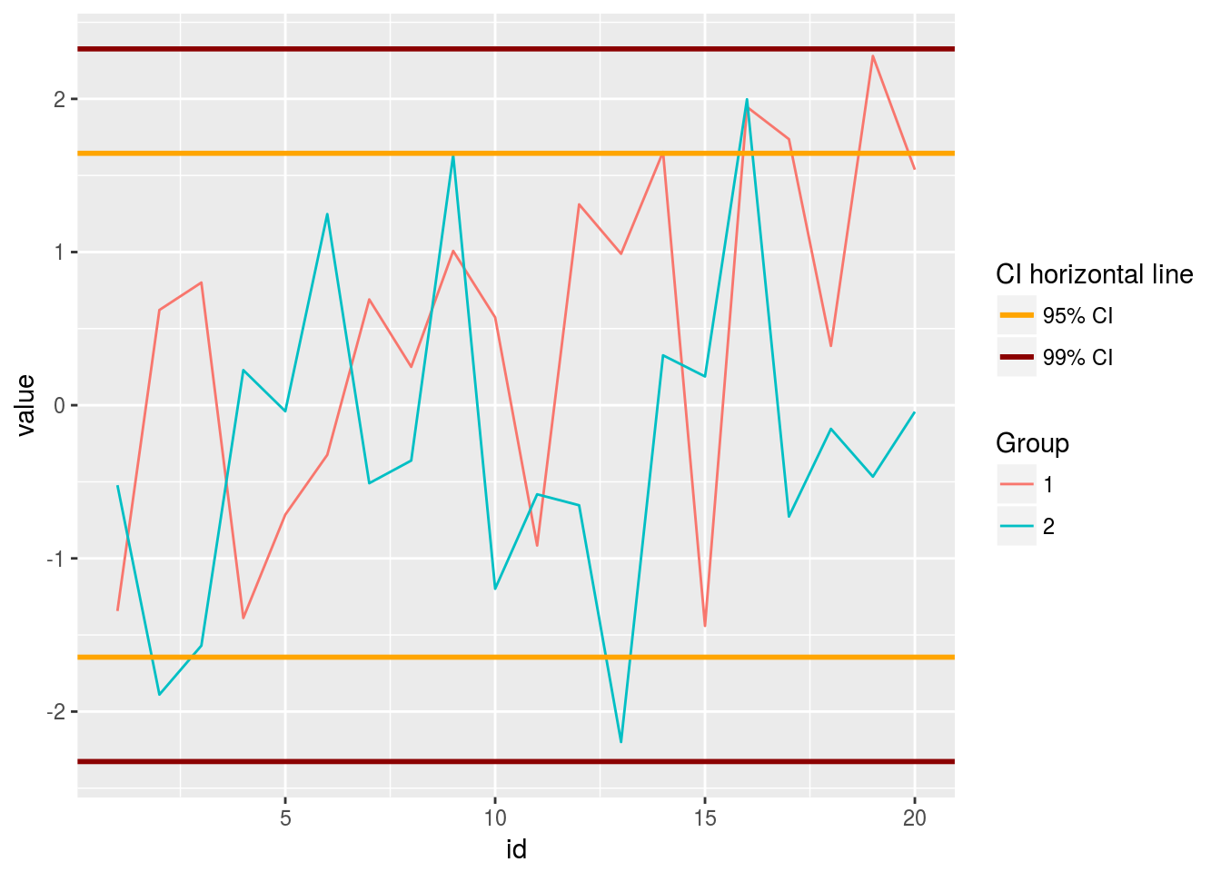
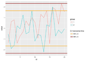
This is the wanted result:
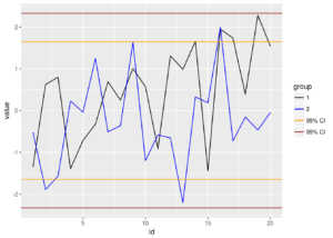
The first version of his plot sounds like the following one:
|
1 2 3 4 5 6 7 |
# Create a Dataframe with Random Data in order to reproduce examples set.seed(456) n <- 20 dfr <- data.frame( id=rep(1:n, 2), group=rep(c("1","2"), each=n), value=c(rnorm(n), rnorm(n, sd=1.1)) ) |
|
1 2 3 4 5 6 |
require(ggplot2) ggplot(data=dfr, mapping=aes(x=id, y=value)) + geom_line(mapping=aes(colour=group)) + geom_hline(yintercept=c(-1,1)*qnorm(0.95), color="orange") + geom_hline(yintercept=c(-1,1)*qnorm(0.99), color="darkred") |
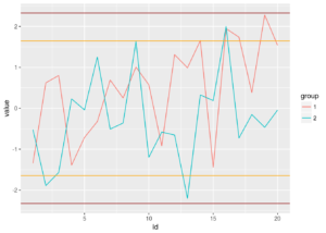 In this plot, he has six lines of four different colors:
- line of values for group 1 (red),
- line of values for group 2 (lightblue),
- horizontal lines for 95% limits (orange),
- horizontal lines for 99% limits (dark red).
When an aesthetic is mapped to data, the legend will be shown automatically. The plot shows the lines for group 1 and group 2.
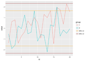
To show the legend also for the horizontal lines, color of horizontal lines should be mapped to aesthetic.
Pay attention to horizontal lines positions, they have to be included in a data frame:
|
1 2 |
df_95ci <- data.frame(y_values=c(-1,1)*qnorm(0.95)) df_99ci <- data.frame(y_values=c(-1,1)*qnorm(0.99)) |
|
1 2 3 4 |
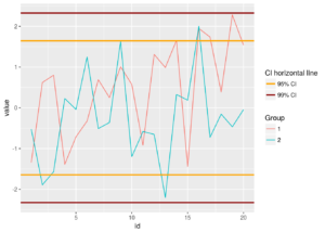
ggplot(data=dfr, mapping=aes(x=id, y=value)) + geom_line(mapping=aes(colour=group)) + geom_hline(data= df_95ci, mapping=aes(yintercept=y_values, colour="A")) + geom_hline(data= df_99ci, mapping=aes(yintercept=y_values, colour="B")) |
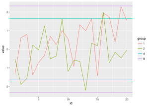 Colours are mapped to “dummy” data. Since the values are shown in the legend, Enrico used labels as “dummy” data.
|
1 2 3 4 |
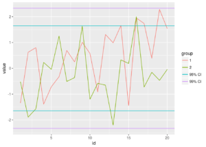
ggplot(data=dfr, mapping=aes(x=id, y=value)) + geom_line(mapping=aes(colour=group)) + geom_hline(data= df_95ci, mapping=aes(yintercept=y_values, colour="95% CI")) + geom_hline(data= df_99ci, mapping=aes(yintercept=y_values, colour="99% CI")) |
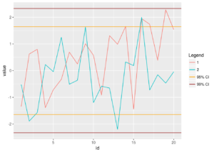
 To set colors for horizontal lines my colleague Enrico used
 scale_color_manual(). This function allows users to choose which colors should be used for each line.
|
1 2 3 4 5 |
ggplot(data=dfr, mapping=aes(x=id, y=value)) + geom_line(mapping=aes(colour=group)) + geom_hline(data= df_95ci, mapping=aes(yintercept=y_values, colour="95% CI")) + geom_hline(data= df_99ci, mapping=aes(yintercept=y_values, colour="99% CI")) + scale_color_manual(values=c("black", "blue", "orange", "darkred")) |
 Enrico set four values for
 scale_color_manual: the first and second refers to the first colours mapped, that are the levels of group. The third value refers to the color Enrico called “95% CI”, the fourth value refers to the color Enrico called “99% CI”.
Of course, using scale_color_manual() information about default colors is lost so the colors for group should be declared. This can be annoying for (at least) two reasons: the number of groups may be not known and palettes are a better choice to get a set of colors. A work around consists of creating a function that rebuilds colors created by ggplot by default.
|
1 |
gg_color_hue <- function(n) {hcl(h=seq(15, 375, length=n+1), l=65, c=100)[1:n]} |
The function is passed to the value argument of the scale_color_manual() function, replacing the color names such as “black” and “blue” in the above plot.
|
1 2 3 4 5 6 7 |
ggplot(data=dfr, mapping=aes(x=id, y=value)) + geom_line(mapping=aes(colour=group)) + geom_hline(data= df_95ci, mapping=aes(yintercept=y_values, colour="95% CI")) + geom_hline(data= df_99ci, mapping=aes(yintercept=y_values, colour="99% CI")) + scale_color_manual( values=c(gg_color_hue(length(unique(dfr$group))), "orange", "darkred") ) |
 At this point, all works and Enrico was satisfied of its work. But the title of the legend, “group”, refers to the first two lines.
|
1 2 3 4 5 6 |
ggplot(data=dfr, mapping=aes(x=id, y=value)) + geom_line(mapping=aes(colour=group)) + geom_hline(data= df_95ci, mapping=aes(yintercept=y_values, colour="95% CI")) + geom_hline(data= df_99ci, mapping=aes(yintercept=y_values, colour="99% CI")) + scale_color_manual(name= "Legend", values=c(gg_color_hue(length(unique(dfr$group))), "orange", "darkred")) |
 The title of the legend can be easily changed, as it is the first argument of the
 scale_color_manual() function. But the best solution for his plot, was two different legends: one for group levels and one for the CI horizontal lines. So Enrico asked me if I know how to do this with ggplot. “Yes, of course” was my reply. “I already did it, in the past”. But this was not true. What I did, was the opposite: I merged several aesthetics in a single legend. Maybe I will write a post about this topic, too. I was pretty sure that ggplot doesn’t implement a solution to have two legends for the same aesthetic by default. This is not coherent with the grammar idea (the GG in ggplot stands for Grammar of Graphics) and the strong link between plot and data behind ggplot2 package. At the same time, I was pretty sure that someone find a workaround to this issue and share its solution on the net. Maybe someone found a solution but she/he did not share this solution with us. I was astonished, the reply to my question was “you can’t do it” (see, for example http://stackoverflow.com/questions/17642190/how-to-set-multiple-legends-for-the-same-aesthetic-in-ggplot2).
During my attempts to get two legends, I tried with two different aesthetics, adding an aesthetic not really useful like size:
|
1 2 3 4 |
ggplot(data=dfr, mapping=aes(x=id, y=value)) + geom_line(mapping=aes(colour=group)) + geom_hline(data= df_95ci, mapping=aes(yintercept=y_values, size= "95% CI"), colour = "orange") + geom_hline(data= df_99ci, mapping=aes(yintercept=y_values, size= "99% CI"), colour="darkred") |
|
1 |
## Warning: Using size for a discrete variable is not advised. |
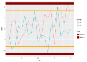 I got two legends, but the legend about horizontal lines does not help to understand the plot, beacuse it does not show the right color of the lines. This is coherent with the goal of the legend, that is clarify what the
 size aesthetic means, but does not help my readers to understand which line refers to which confidence interval (95% or 99%).
Fortunately, guide_legend() allows to change some aesthetic, like the colour, to the elements of the legend.
|
1 2 3 4 5 6 7 |
ggplot(data=dfr, mapping=aes(x=id, y=value)) + geom_line(mapping=aes(colour=group)) + geom_hline(data= df_95ci, mapping=aes(yintercept=y_values, size= "95% CI"), colour = "orange") + geom_hline(data= df_99ci, mapping=aes(yintercept=y_values, size= "99% CI"), colour="darkred") + scale_size_manual( "CI horizontal line", values=rep(1,4), guide=guide_legend(override.aes = list(colour=c("orange", "darkred")))) |
 This is what I was looking for: multiple legends for a single aesthetic. Finally, I only added the name for the legend of the
 group level, and all was done. As seen above, “hue” is the default scale for ggplot discrete colours. So the function, is scale_color_hue().
|
1 2 3 4 5 6 7 8 9 |
ggplot(data=dfr, mapping=aes(x=id, y=value)) + geom_line(mapping=aes(colour=group)) + geom_hline(data= df_95ci, mapping=aes(yintercept=y_values, size= "95% CI"), colour = "orange") + geom_hline(data= df_99ci, mapping=aes(yintercept=y_values, size= "99% CI"), colour="darkred") + scale_color_hue("Group") + scale_size_manual( "CI horizontal line", values=rep(1,4), guide=guide_legend(override.aes = list(colour=c("orange", "darkred"))) ) |
 That’s all folks!!! Just some notes:
- “Dummy” data are useful for this example, and so they are used also to set labels. By the way, labels for the legend can be set using the
labelsargument of thescale_size_manual()function (and, of course, of any otherscale_*_*function).
12345678ggplot(data=dfr, mapping=aes(x=id, y=value)) +geom_line(mapping=aes(colour=group)) +geom_hline(data= df_95ci, mapping=aes(yintercept=y_values, size= "95% CI"), colour = "orange") +geom_hline(data= df_99ci, mapping=aes(yintercept=y_values, size= "99% CI"), colour="darkred") +scale_color_hue("Group") +scale_size_manual("CI horizontal line", values=rep(1,4),guide=guide_legend(override.aes = list(colour=c("orange", "darkred"))),labels=c("CI of 95%", "CI of 99%"))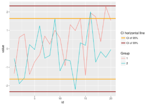
- As seen above, changing labels will change the order of the legends. To set the order, the
guide_legend()function provides anorderargument.
12345678ggplot(data=dfr, mapping=aes(x=id, y=value)) +geom_line(mapping=aes(colour=group)) +geom_hline(data= df_95ci, mapping=aes(yintercept=y_values, size= "95% CI"), colour = "orange") +geom_hline(data= df_99ci, mapping=aes(yintercept=y_values, size= "99% CI"), colour="darkred") +scale_color_hue("Group", guide=guide_legend(order=1)) +scale_size_manual("CI horizontal line", values=rep(1,4),guide=guide_legend(override.aes = list(colour=c("orange", "darkred"),order=2)),labels=c("CI of 95%", "CI of 99%"))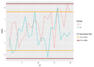 Article originally published on Nov 2015 on MilanoR and now modified by Veronica Giro to maintain compatibility with the latest version of
 ggplot2.

Trackbacks/Pingbacks